Climate Collective Mosambi
Figma, UX Research, UI Design System
Timeline
4 weeks
Team
4 Product Designers
My Role
UX/UI Design, Research, Design System
Driving conversion for the Mosambi platform by replacing the “Black Box” login with value-first onboarding.

The Problem
The “Leap of Faith” Barrier
Forcing a login before showing value creates a high bounce rate; the “cost” of data entry often outweighs the “perceived benefit” of an unproven platform.
The Momentum Kill
Hitting a multi-field signup form at the moment of registration creates a jarring experience that kills user intent and lead conversion.
The Ambiguity Gap
Without a clear “Digital Host” or status indicator, users feel lost and abandoned, leading to high abandonment rates mid-transition.
Research
We conducted a competitive analysis beginning with Mosambi, mapping how comparable platforms approach user acquisition, community building, and onboarding within the climate and professional networking space.
Mosambi
Climate tech professionals and startups in the Global South — Search & match services and talent for startups in the climate tech space
Sayuj
Entrepreneurs and startups in India — India's exclusive startup community network
Working professionals and job-seekers across the globe — Networking and hiring for professionals across the world
Climatebase
Climate professionals and job-seekers across the globe — Hiring platform for the climate industry
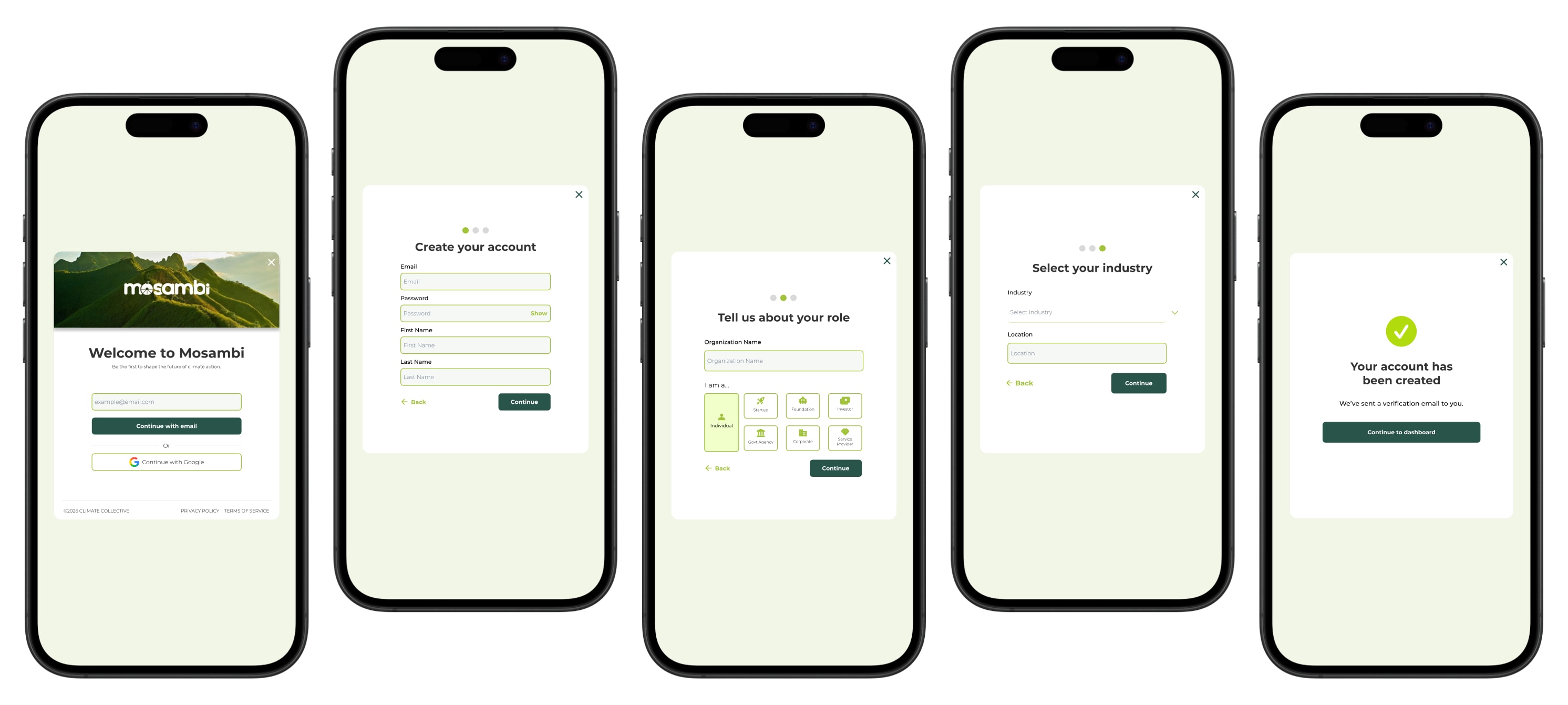
The Solution
3-Dot Progress Indicator
3 dots at the top of every screen tell the user exactly how much of the signup is left — removing ambiguity and keeping them moving forward.

“Who Am I” Icons
Instead of a long dropdown, I used visual icons for user roles — making the choice feel instant and intuitive rather than administrative.

Already Have an Account?
A clear login path is built into the flow for returning users, so they can bypass signup entirely and get straight back to what they came for.

The Impact
We validated this approach with 12 users through high-fidelity usability testing. The data confirmed that transparency leads to higher engagement.
81%
Completion rate
The vast majority of users navigated the entire sequence and successfully unlocked the features they were seeking.
92.9s
Guest → Member
Users moved from the initial prompt to their unlocked state in under two minutes.
Community
#1 most exciting feature
Post-test feedback revealed Community as the feature users were most excited about — skeptics converted into members before the first form field.
Next Steps
I’d like to run additional rounds of user testing to surface edge cases the first study didn’t catch — especially moments where users fail to log in or get stuck mid-flow. Each new failure pattern is an opportunity to design clearer error messaging and recovery paths so users never feel abandoned.
I’d also partner with developers to understand how the platform detects bots and spam sign-ups, and whether we need to introduce verification steps — CAPTCHA, email confirmation, or rate limiting — without adding friction to legitimate users.
On the authentication side, I want to track emerging patterns like Apple Keychain, passkeys, and facial recognition to see how they could make sign-in faster and more secure. Alongside that, I’d align with stakeholders on whether to expand beyond Google sign-in — adding another social provider (LinkedIn, Apple, etc.) to meet users where they already are.
Finally, I’d audit the flow for every error state users might encounter — wrong password, network drop, account already exists — and design consistent, helpful messaging for each one.